Client:
Windows
Role:
Creative Direction, Content Strategy, System Design
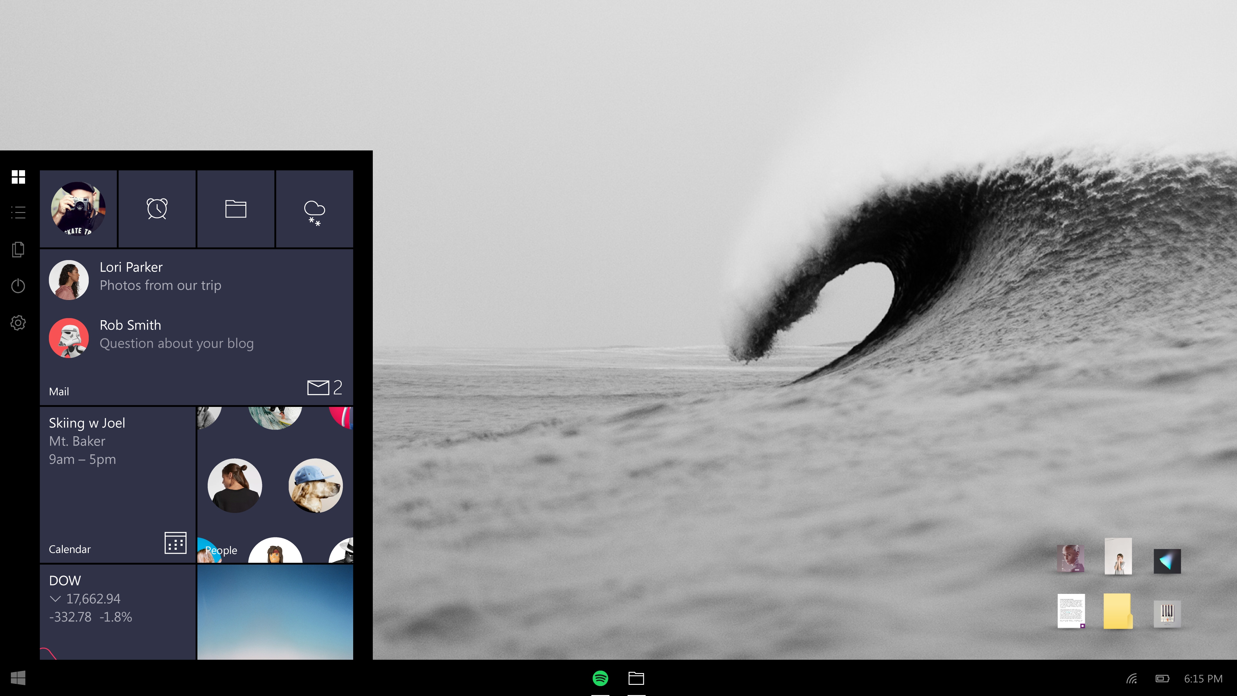
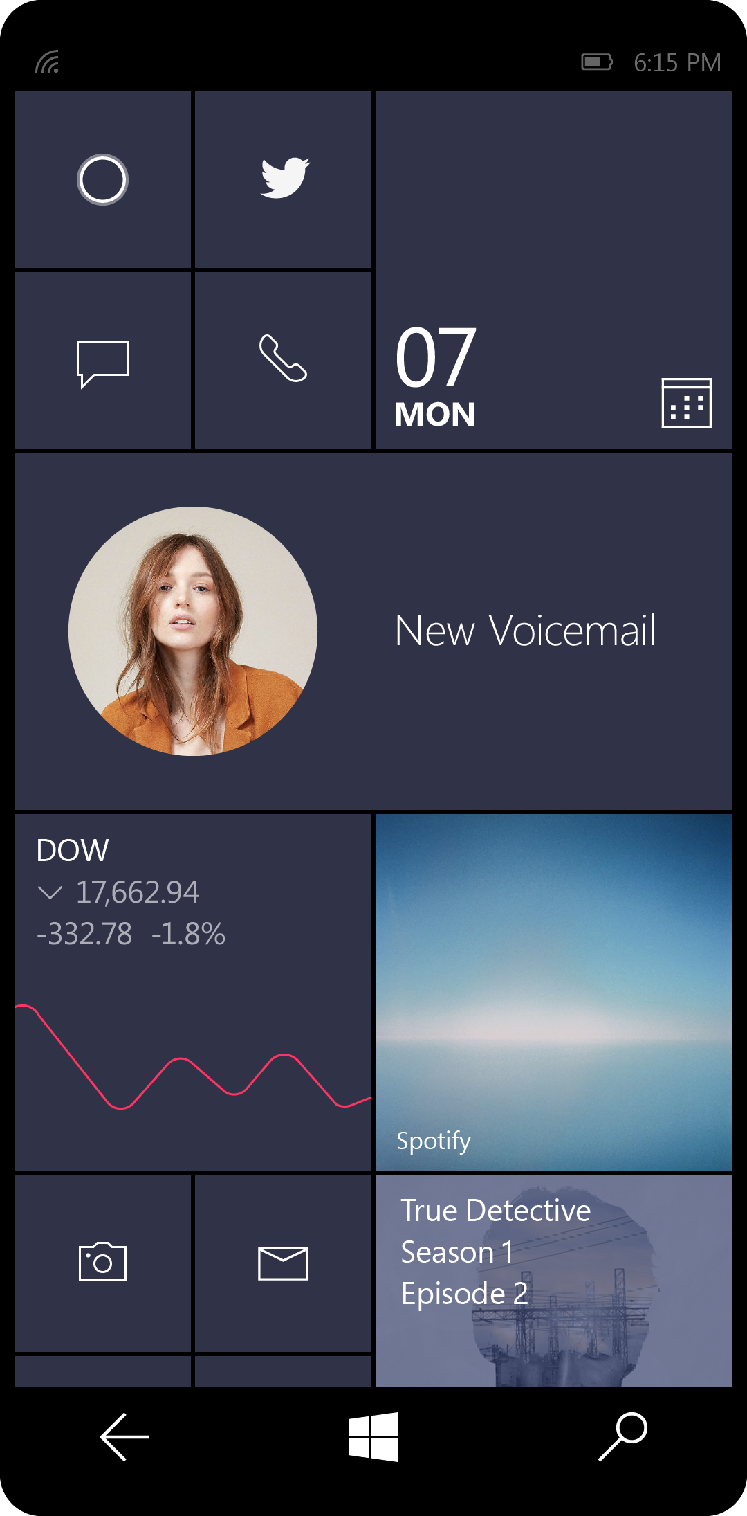
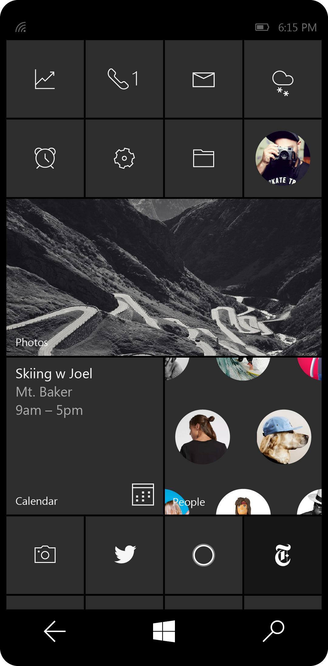
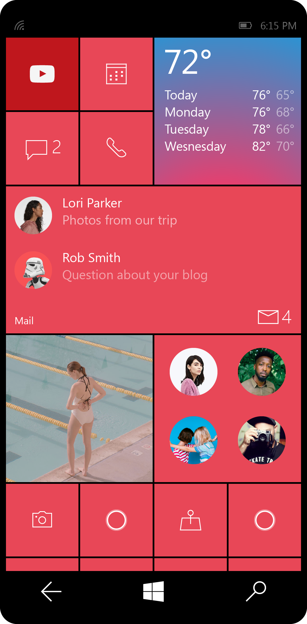
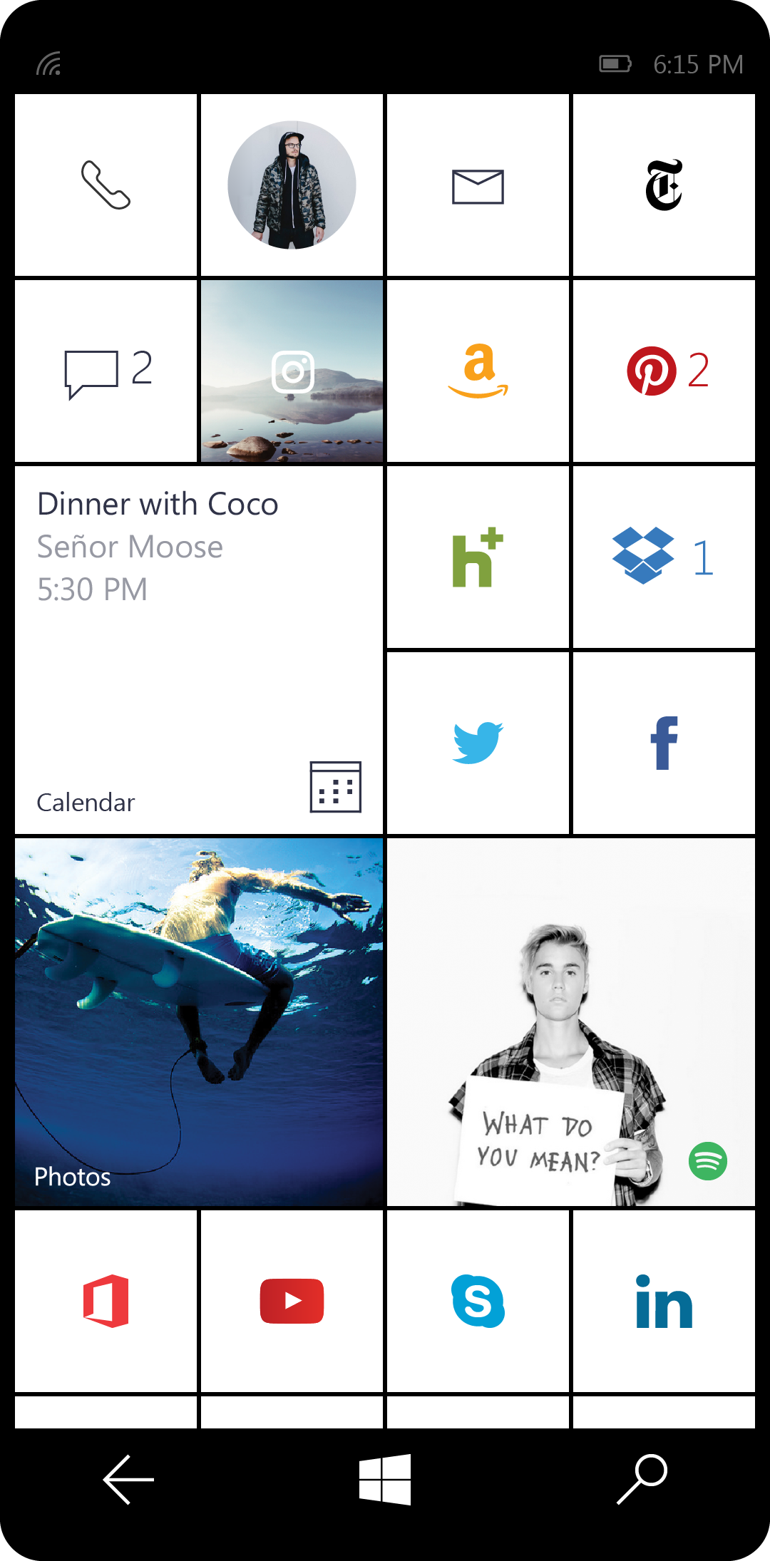
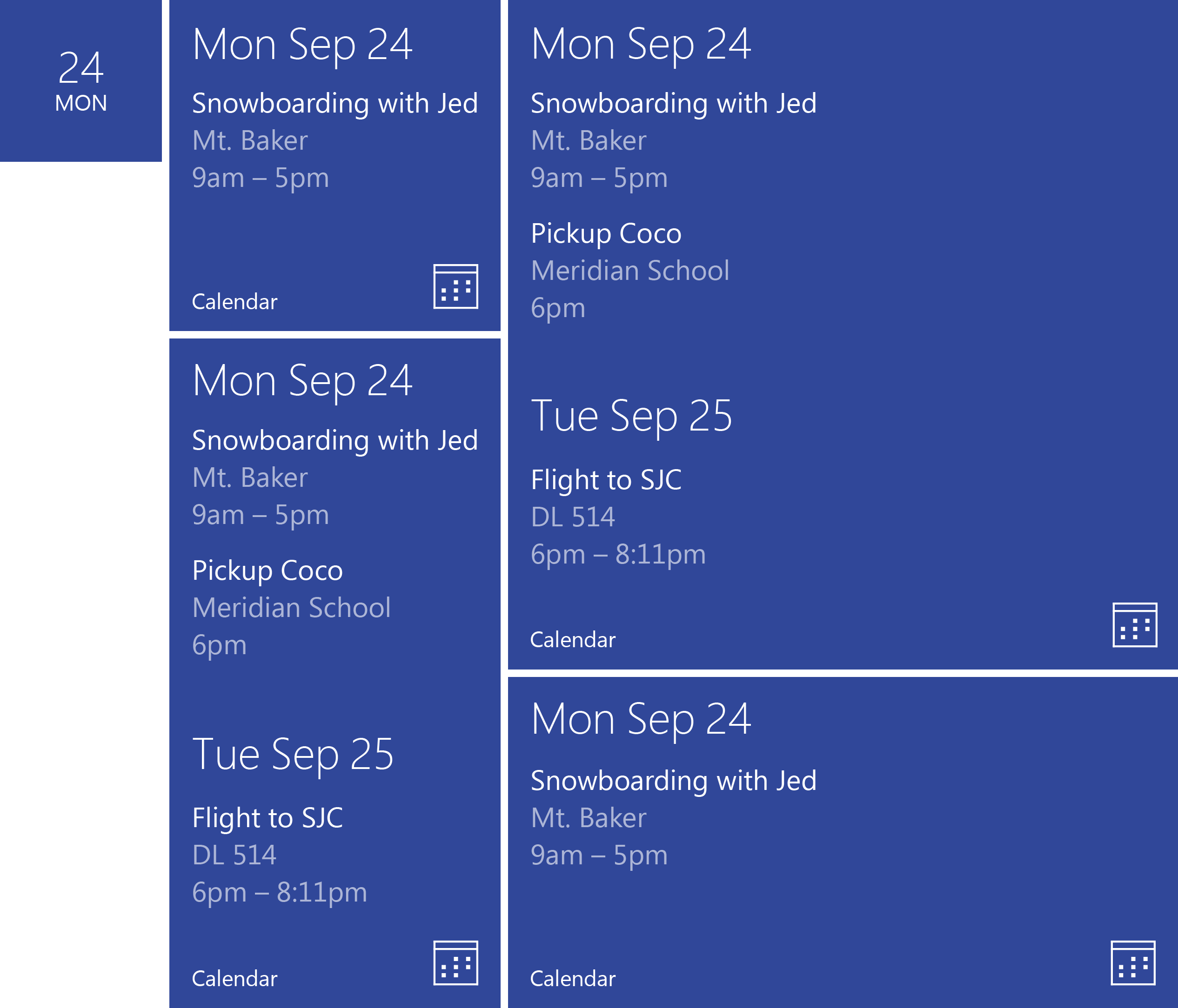
As Microsoft was reimagining the design language for Windows 10, I was tasked with the Start experience—integrating the Windows Phone OS with the Windows OS. My chief goal was to preserve the brand’s iconic stature while also allowing for more flexibility, openness, mass appeal, and elegance. I envisioned a simple, responsive system where Start felt less like stacked boxes and more like windows into the apps that define our personal interaction with the world.
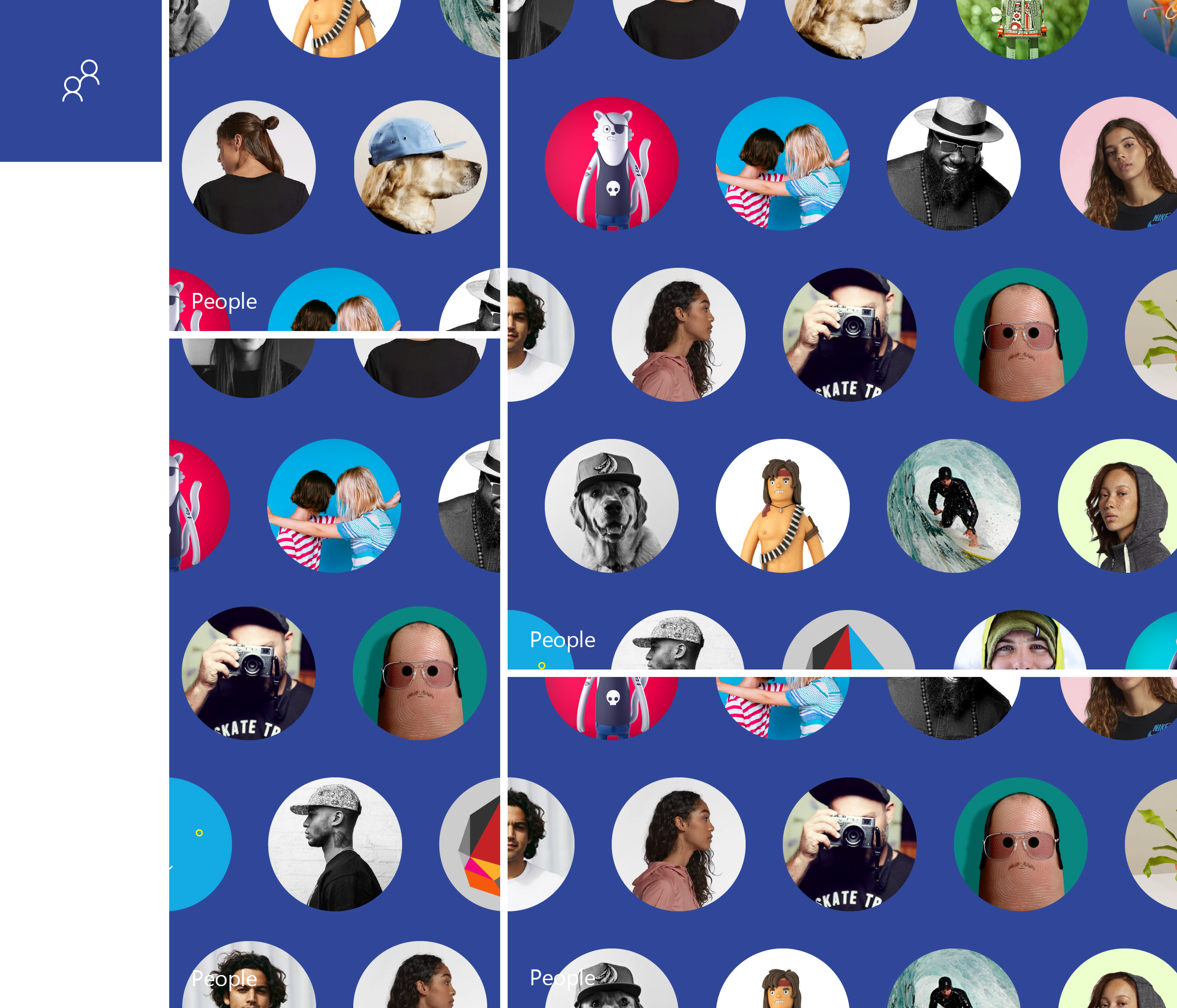
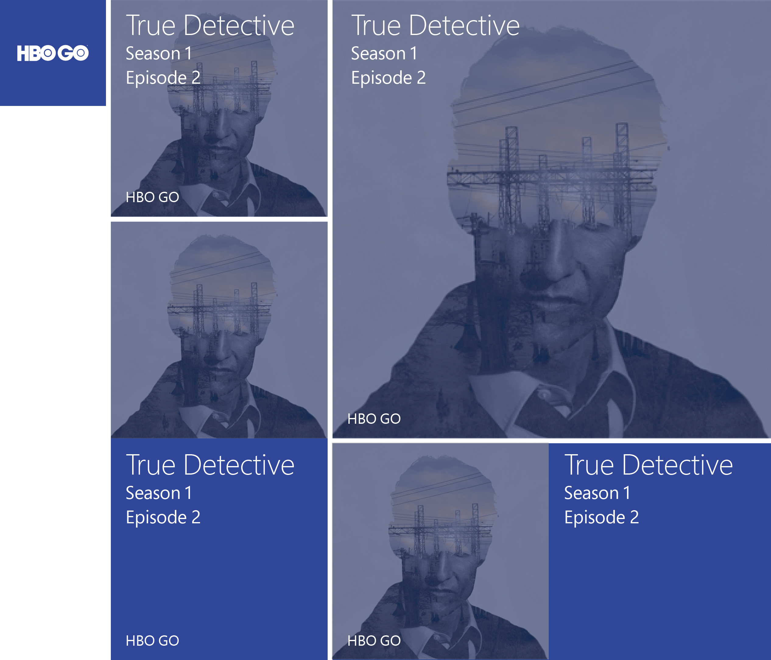
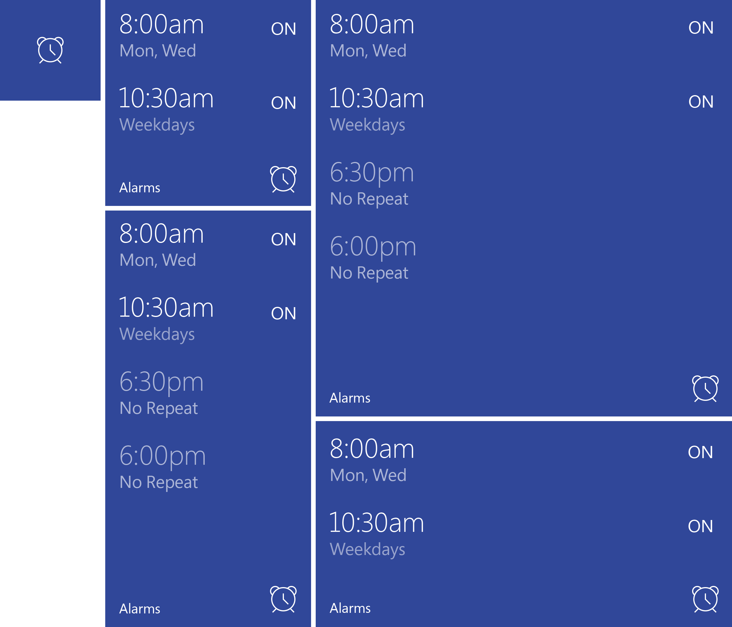
STYLEGUIDE
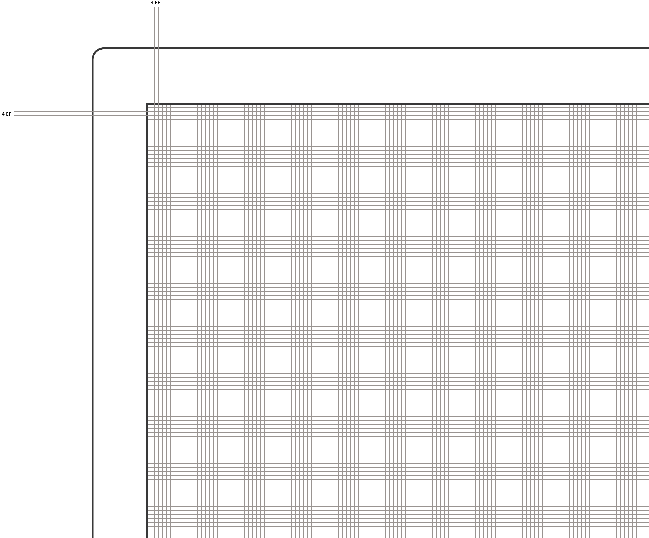
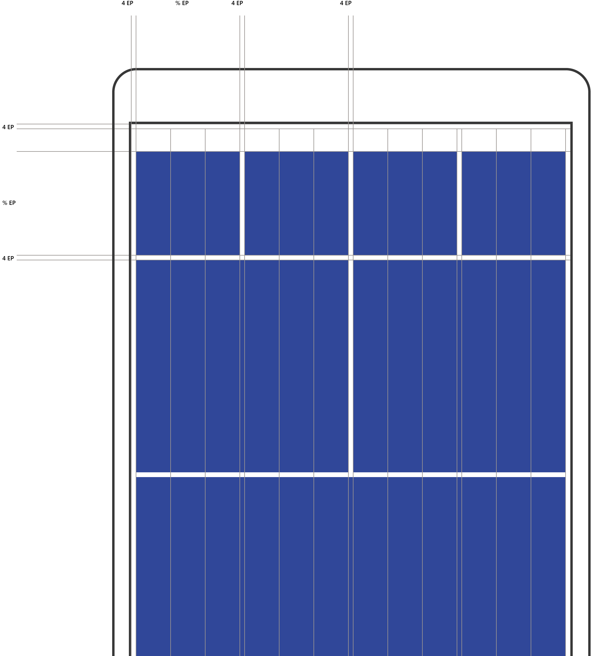
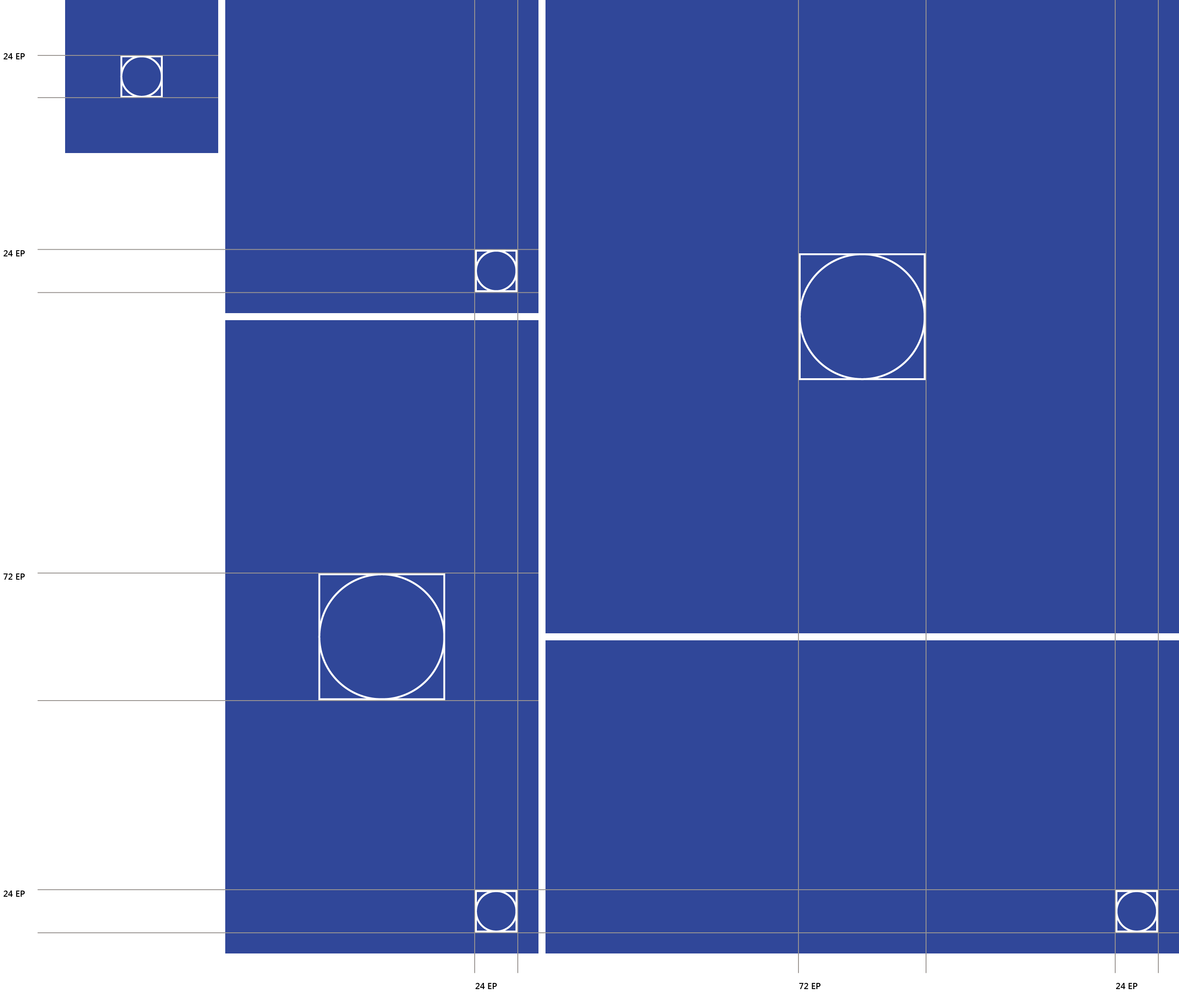
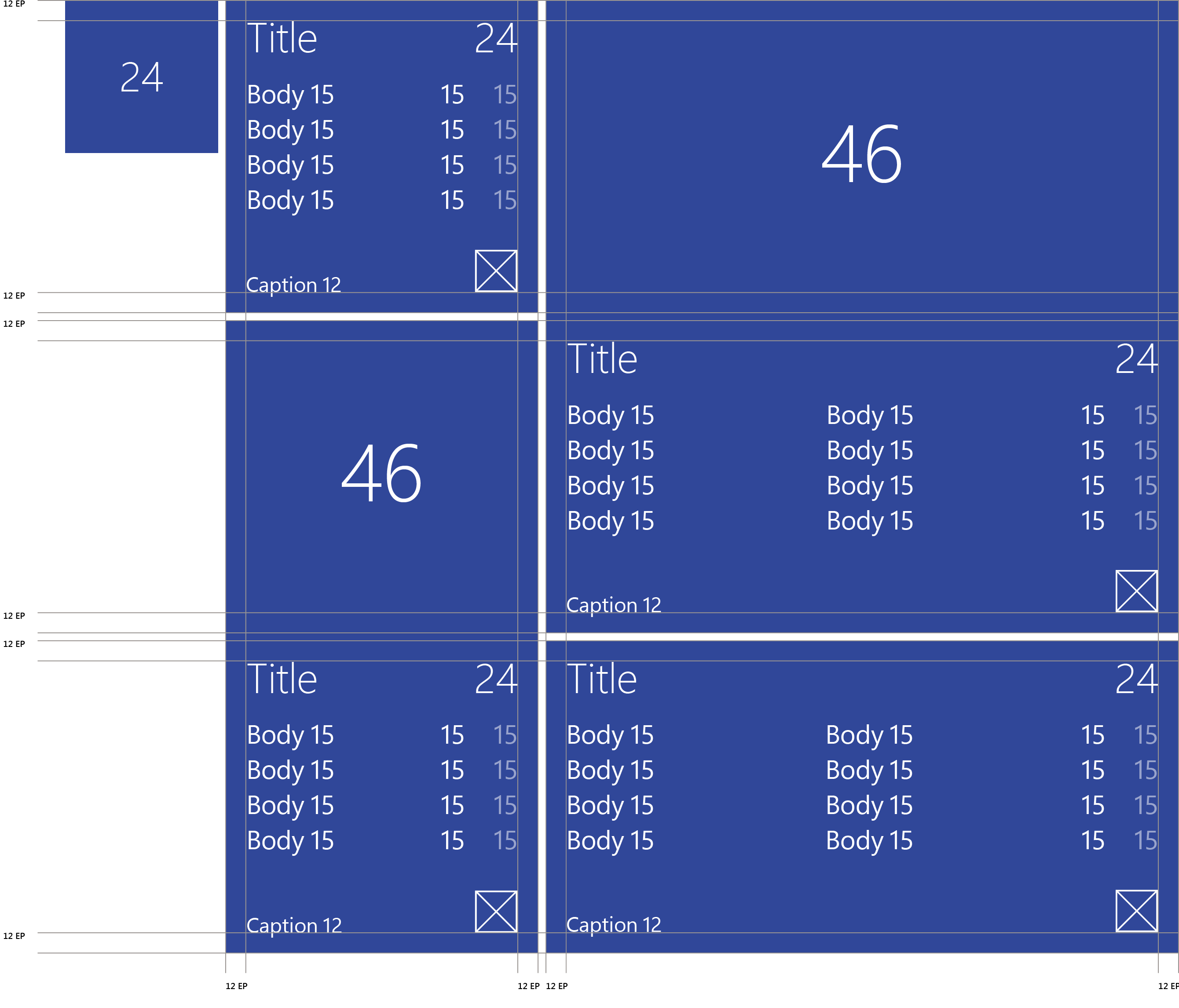
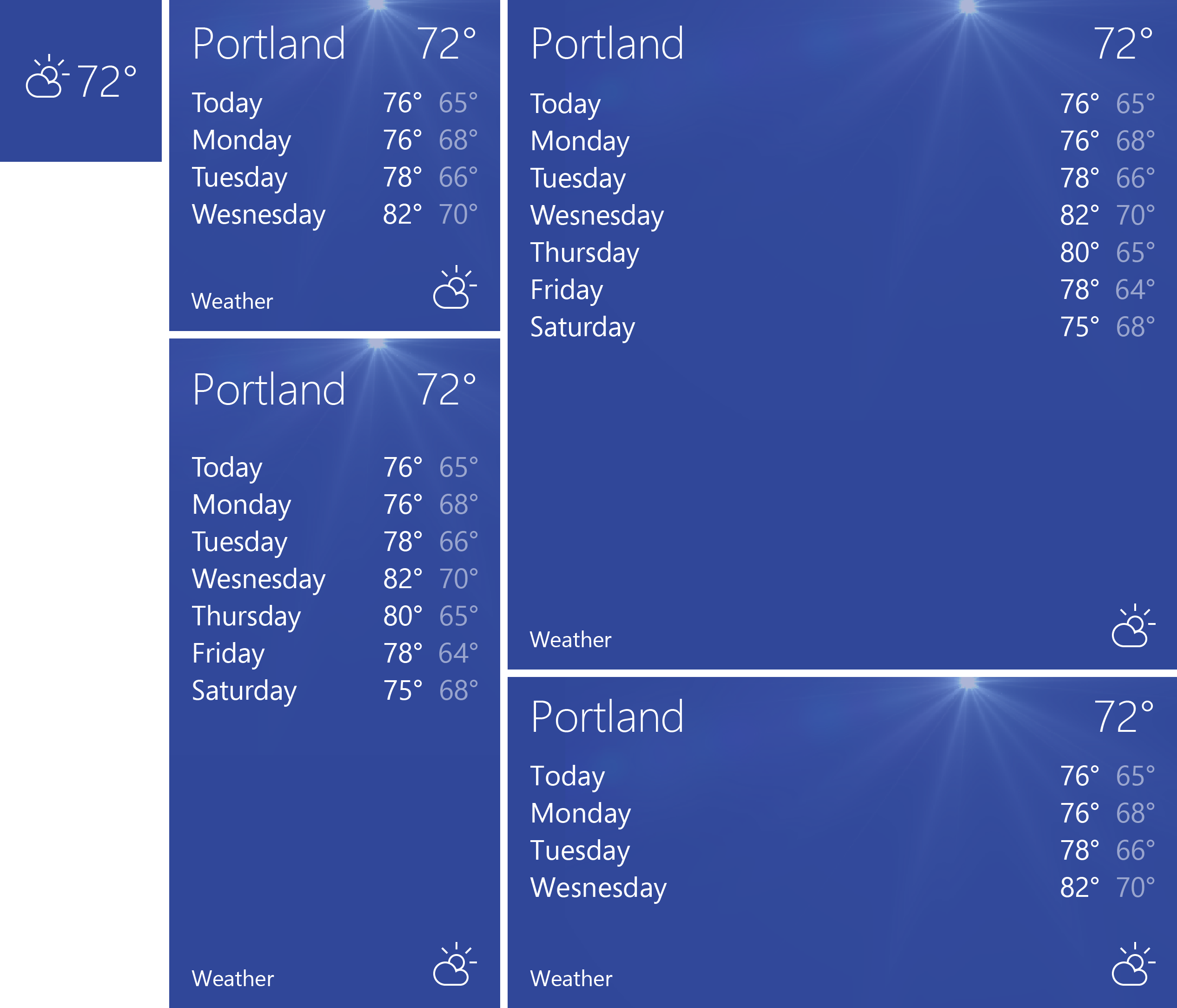
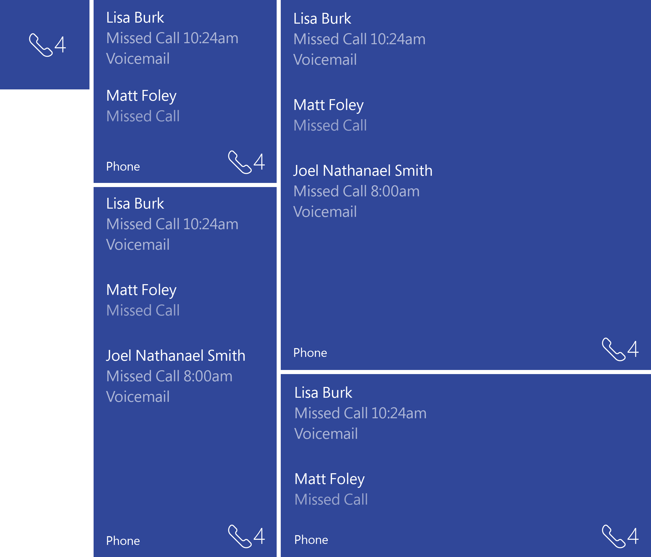
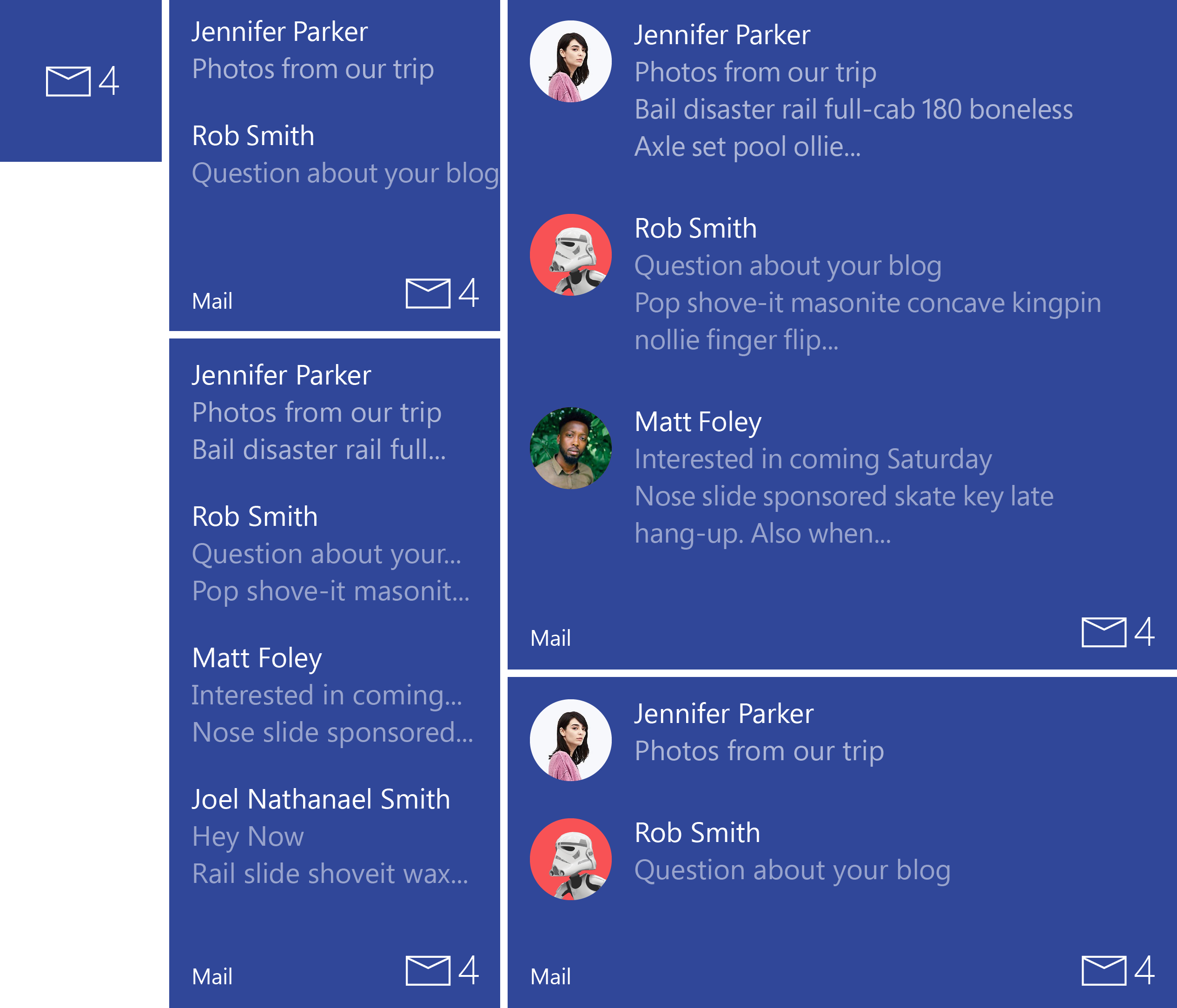
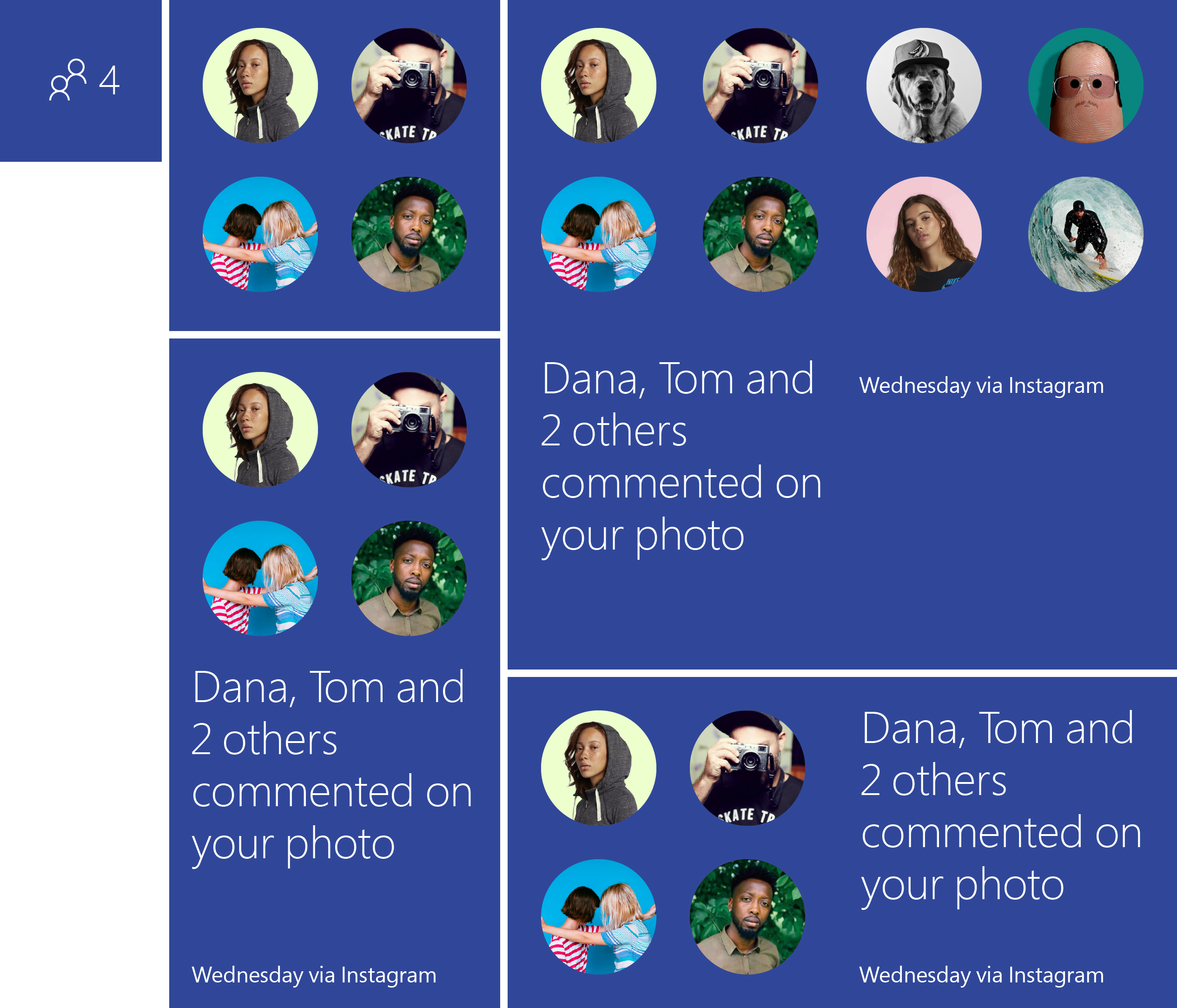
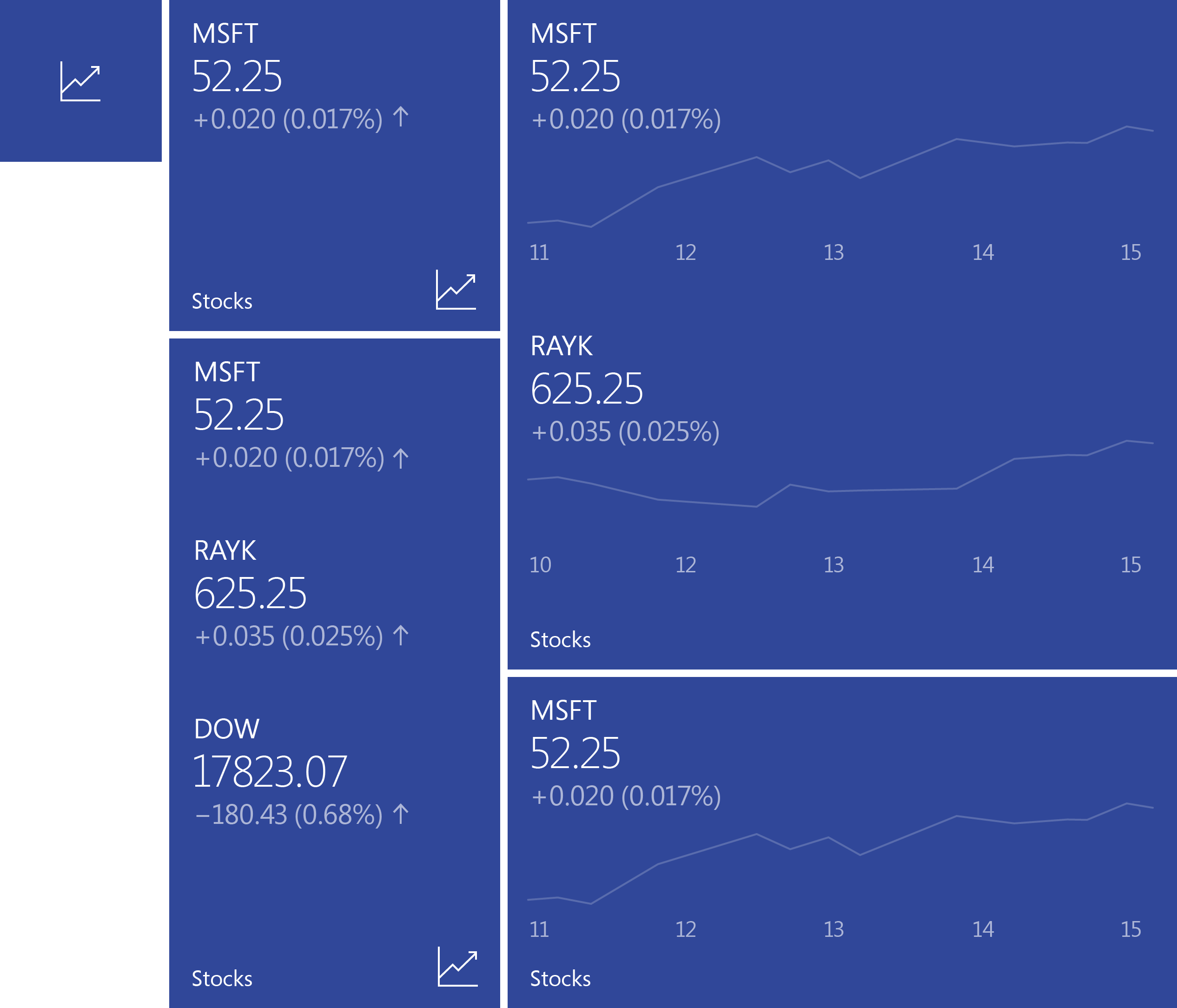
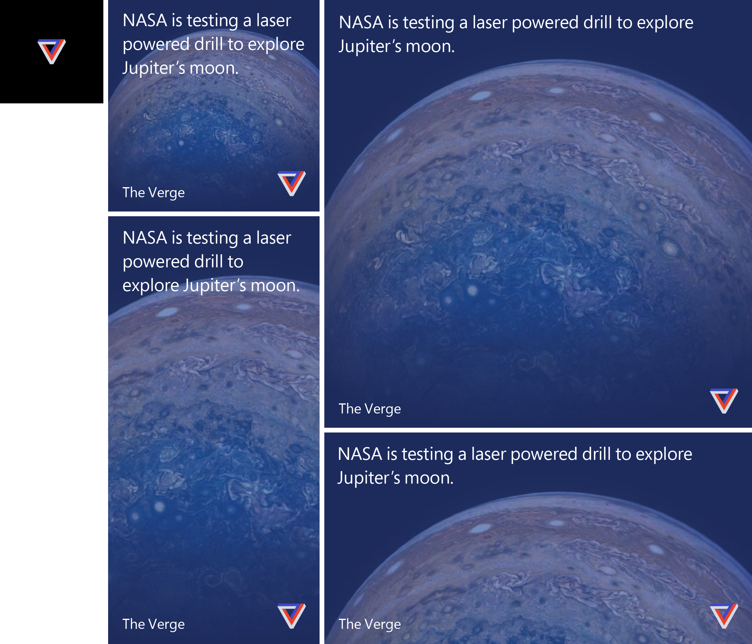
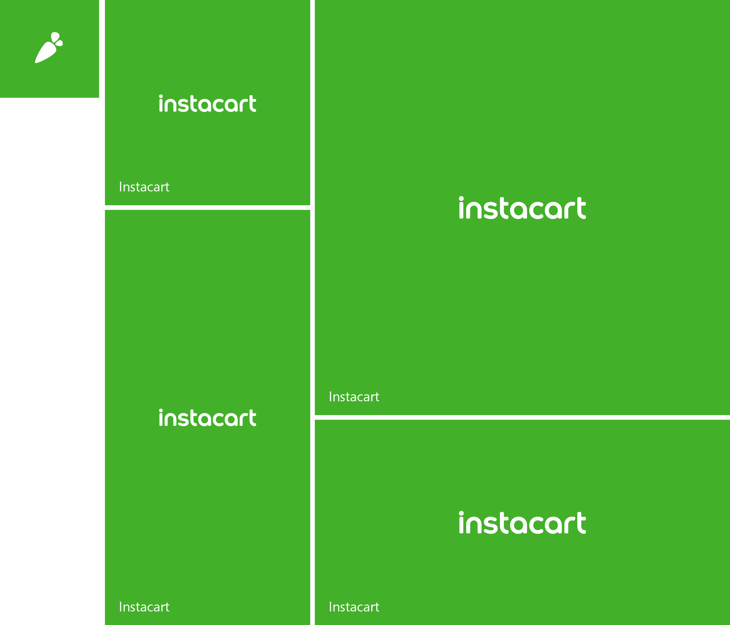
Before converging the operating systems, I had to examine the merits and constraints of each and build from a new, standardized grid that allowed content to scale to any Windows device, regardless of screen size. I redesigned the app-icon story to include a basic proportion for standard branding including guidelines for vertical and horizontal identities. I standardized the tile sizes and dimensions, and interaction guidelines for updating content. Motion sequencing governing frames was also included in this style guide and documentation.
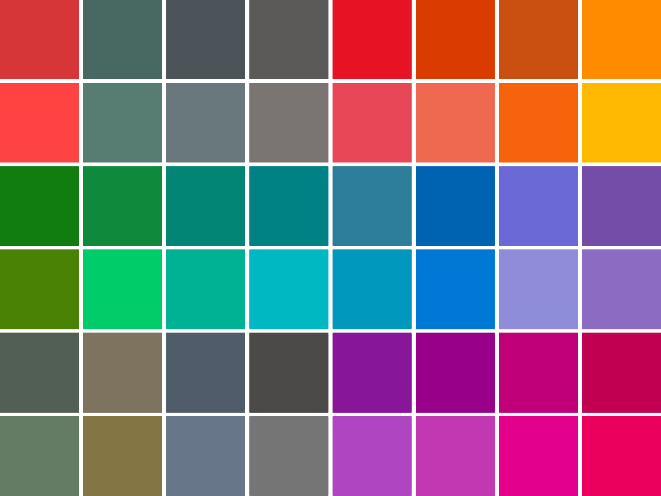
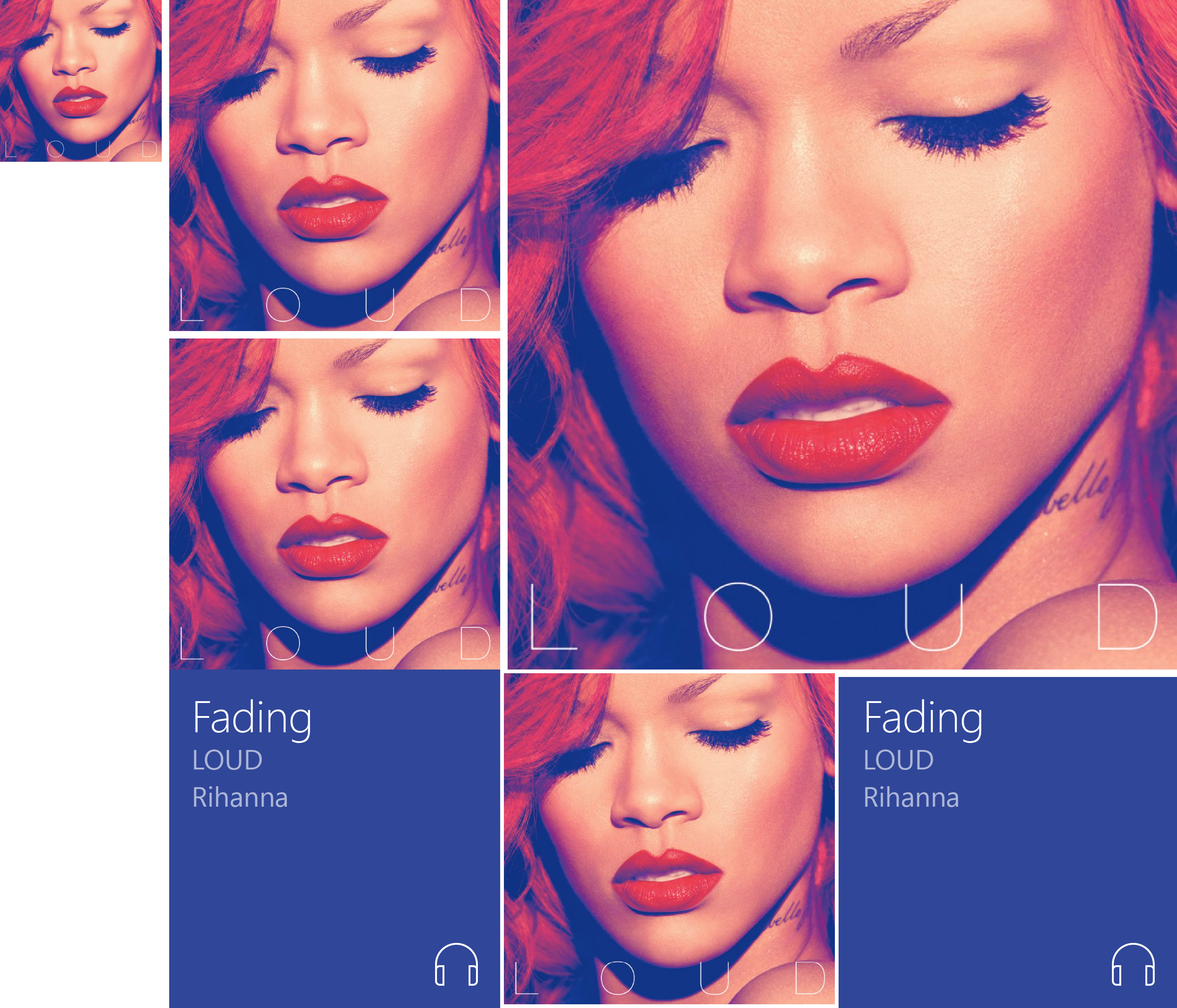
COLOR
Windows OS had its own design language separate from Windows Phone. Which also meant the color and type stories were separate. I reconciled the most important parts of each operating system and merged the two, starting with a unified, expanded color palette that would work across all products, themes, and accessiblity standards.
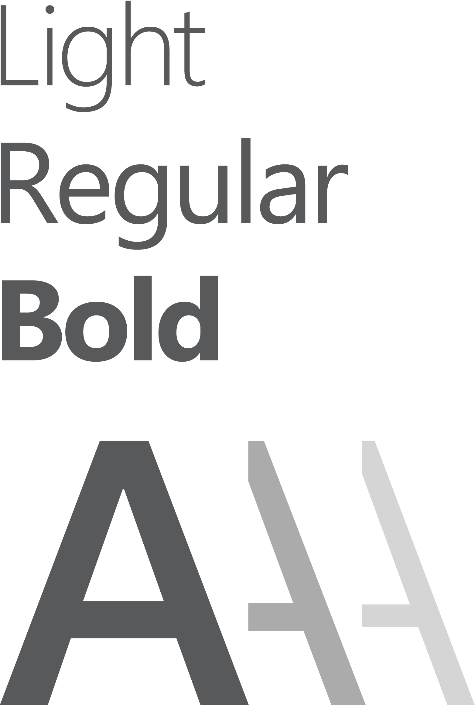
TYPOGRAPHY
Under my direction, type became a single version of the Segoe family. Instead of baked images being sent down as bitmaps, Start Tiles were now responsive, adjustable containers where text strings scaled to columns and rows. I designed the type ramp, type weights, and custom line spacing to work fluidly with every conceivable combination of type, color, imagery, brand, etc. The effort, however tedious, made for a consistent and legible platform for designers and developers.
BASIC TEMPLATES
vich
2019 Christopher Raykovich © All rights reserved